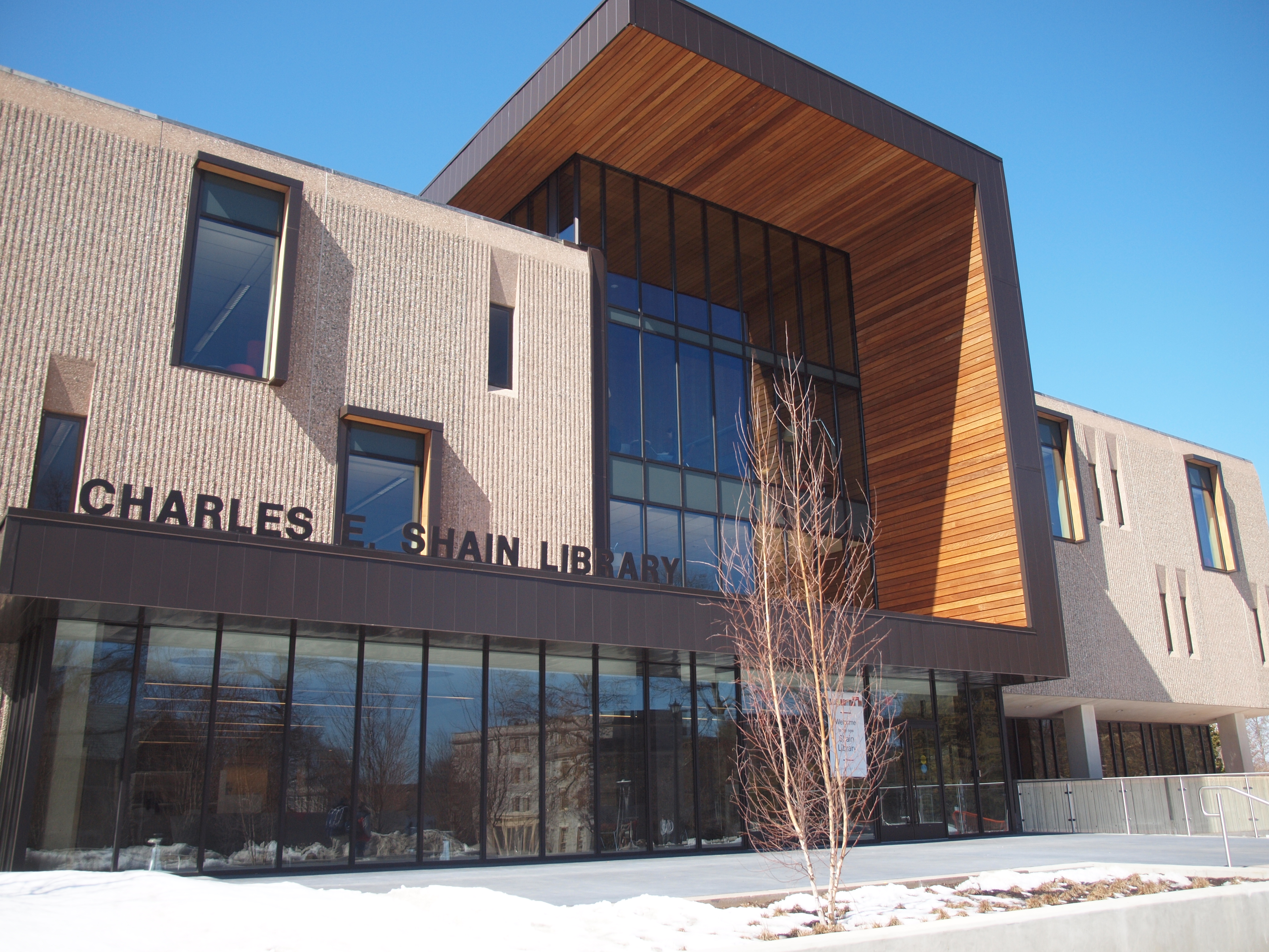
My old go-to study spot is back, and it’s all shiny and new.
“No Pain, No Shain,” was the slogan we heard all year during our library’s renovations, and while there were certain times when I truly, dearly missed the library, the $9 million dollar project was completed five months ahead of schedule and we now have a spiffy new study space for the last two months of school. The interior was best described to me by one student as “how the future was imagined in the '70s.” It’s true; there is an interesting balance between modern and retro design. Given the original '70s architecture of the building, I think it works. There are a number of new study spaces on all four floors. Every nook and cranny is filled with new comfy chairs and desks, a nice touch considering how packed the library becomes during midterms and finals.
What I’m most excited about is the light. There’s so much of it! Old Shain, with its tiny windows, was dark. New Shain, on the other hand, has much larger windows, making for much happier studying as the light pours in and brightens up the space.